dat-ecosystem website_terminal #105
Comments
Tasks
WorklogFeedbackProposals |
|
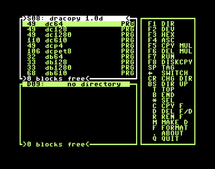
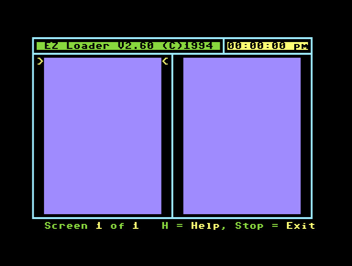
feedback notice the tab bar has fine lines. looks crisp. retro systems did not have such high resolutions, so things looked a big "bolder" maybe? love everything, just thinking if we can find inspiration and subtle ways to make it look more retro :-) The glow effect is a good idea, but if we have it it needs to be pixelated, e.g. also, take a look at the images here and how they are monochrome low color pixelated here is another retro style website https://tilde.club/wiki/tildeverse.html here is some more inspiration
|


tasks
worklogfeedbackproposals |
|
feedback 😅 hmm, not sure if new or old shell was better. UX
UI
I think "color dither" and more retro window frame helps too in making things retro maybe.
Also, displays back in the days where not as crisp, so in addition to low color monochrome dither gradients, they had sometimes other artifacts and maybe subtle pixel patterns can emulate those, ...not sure if like below or similar would help anything, e.g. |

tasks
worklogfeedbackproposals |
|
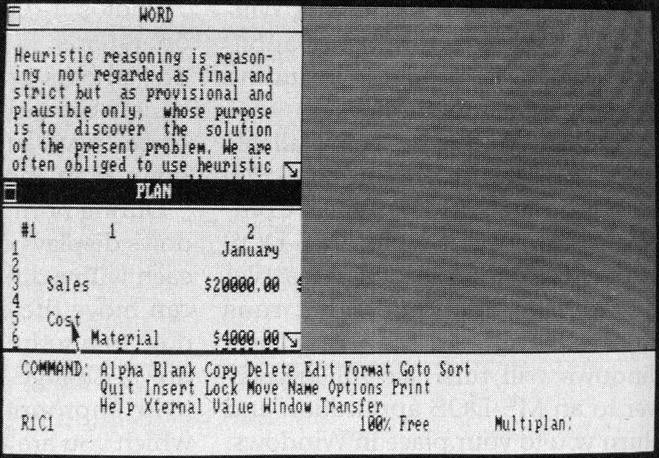
feedback Great. Look at this one for example - a lot is going on there, but everything you can see somewhat feels visually like it belongs to the same style I will prepare a few more links and pictures for inspiration of typical retro UI elements and styles we could copy/steal from :-) Maybe scrollbar should stop/end before the buttons?
That way we could maybe integrate the up/down arrows into the bottom menubar, on the right side of the dates dropdown? like here (some retro scrollbars) I like the overall terminal. Most retro UI had some sort of explicit borders. For example So from previous comments here i think the following are representative: This one when it comes to visual elements and borders: ⭐ ⭐ ⭐ This one when it comes to monochrome. Now if you think of the above and compare them with your current design, your design still has quite a modern touch compared to the real retro stuff :-) or not? Now another thing is, that almost all retro consoles/terminals/etc... where always black. The add tab button and close shell are fine, but the minimize looks like a counter part to the + so maybe people would expect to remove tabs or maybe to zoomin zoomout. like maybe Can you also take another look at the following links and click images to take a closer look
They all contain specific inspirational typical retro elements and ideally we can pick the best most creative cool retro UI elements and combine them nicely :-) quick single picture gallery:
|


tasks -
|
|
feedback You make a good point with containers in the content area I think we definitely need a focus color (maybe orange or pink or green)
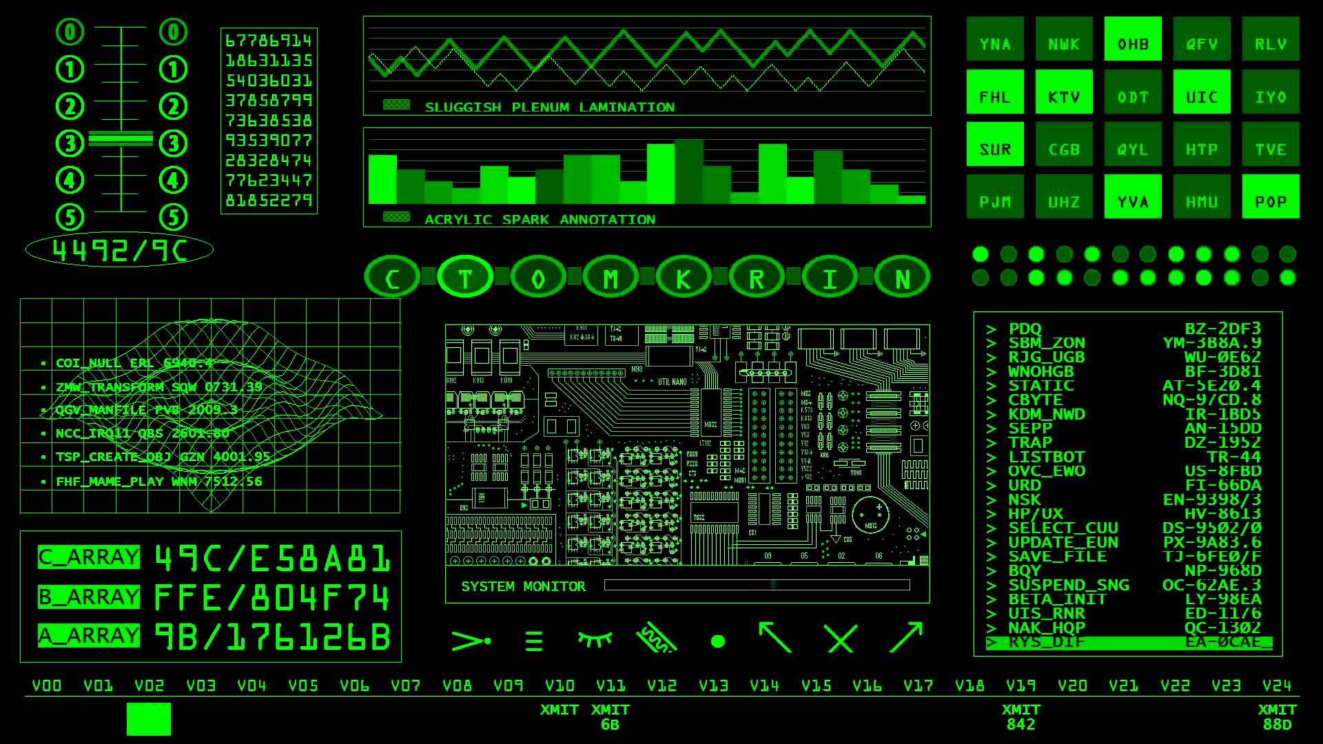
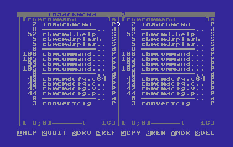
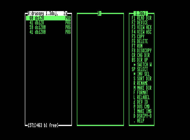
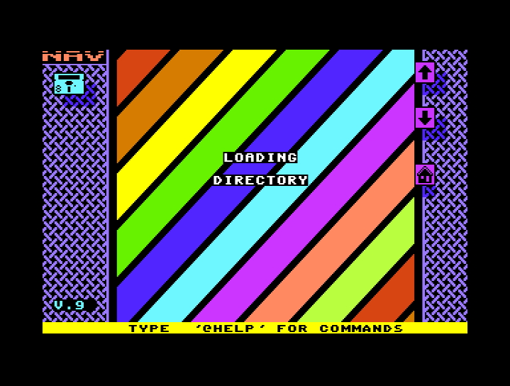
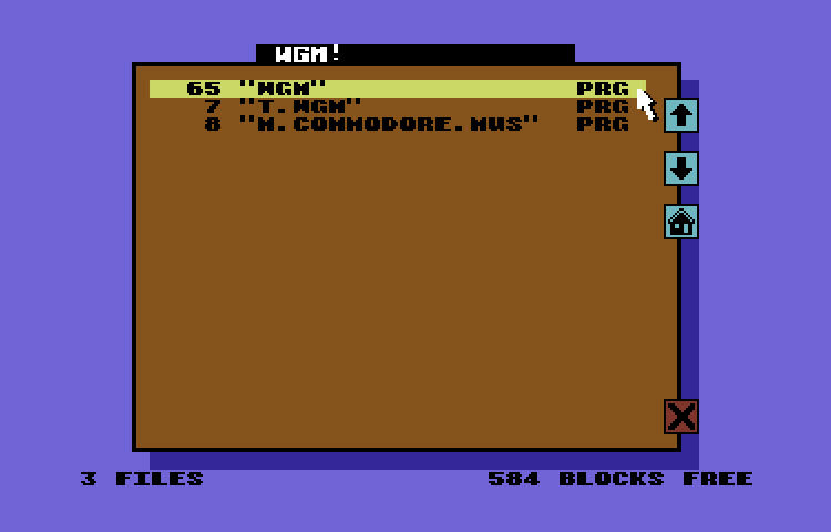
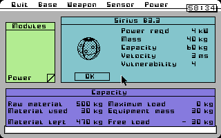
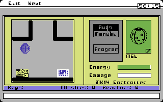
ALSO: Below i will mix some retro screenshots with the screenshots from our current design. I kinda wish we could homogenize the style and really keep it even more retro. I think things get better slowly, but don't feel shy to put some serious hours in and also standardize everything more into one retro style. I will attach again some more pictures. Just to keep in mind, users will anyway use their scroll wheel or maybe click the scrollbar and drag it, nobody really uses the scroll bar arrows anyway, they are more a "visual gimmick" to make it appear more retro. For example scrollbar Basically those are also very representative. mono color and again everything is compact and aligned. Here is that applied to the terminal, but of course, i am not good in making it look more retro, like the image above, but still, just to share what i mean: the following also has a lot more retro touch, if that is possible to achieve. This one for example is even older and even more retro, so if you can even do that, that would be cool I just think the whole thing needs some retro ❤️ ❤️ ❤️ 🙂some more real retro screenshots (you might need to zoom in on some) Basically those links help: Can you also take another look at the following links and click images to take a closer look check also these to see how we can make things more retro |


tasks -
|
|
feedback Great. At first i was sad for the terminal to not have the pink window bar anymore. Also the more squeezed font in the terminal tabs makes it look more retro. that's cool. I also like the renaming of So all great.
Basically, something that makes sens to align all windows, scrollbars, icons etc... in an invisible grid to be multiplze sizes of a basica square and aligned to each other, so that is the main goal - currently we still have if we later "move" windows around or icons, they should probably snap from one grid unit to the next instead of being continuously dragged - but that needs to wait until we actually implement it, but it also means nothing can be resized or positioned in between those invisible square grid blocks |

tasks -
|
|
feedback +1 perfect changes. i think the terminal is great. |
#70
@todo@input📦 terminal_frame_v0.0.5 from dat-ecosystem website_terminal_frame #86xicon@output📦terminal_v0.0.1from comment@input📦terminal_v0.0.1@output📦terminal_v0.0.2from comment@input📦terminal_v0.0.2@output📦terminal_v0.0.3from comment@input📦terminal_v0.0.3@output📦terminal_v0.0.4from comment@input📦terminal_v0.0.4@input📦scrollbar_v0.0.1from dat-ecosystem website_scrollbar #108@output📦terminal_v0.0.5from comment@input📦terminal_v0.0.5@input📦scrollbar_v0.0.2from dat-ecosystem website_scrollbar #108@output📦terminal_v0.0.6from comment@input📦terminal_v0.0.6@output📦terminal_v0.0.7from commentThe text was updated successfully, but these errors were encountered: